17 May Social Demographics – Infographic
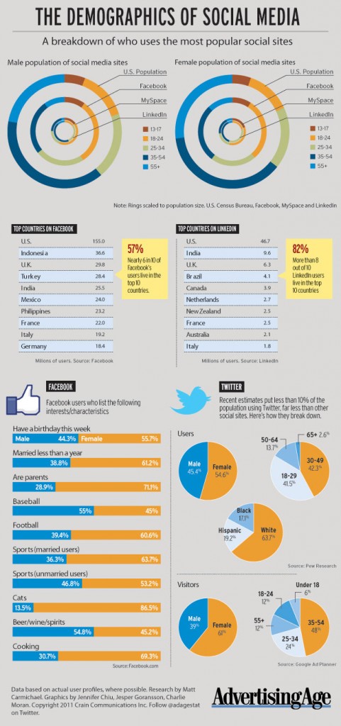
This week Ad Age put out this social demographic map of the users of major social sites.
What I don’t understand is why they measured MySpace as one of the top social sites. I get that it still has users and traction, but considering the influx of newer platforms like posterous, tumblr, and Twitter, this is an interesting choice for comparison.
Big takeaways
- 6 out 10 of the Facebook’s users live in the Top 10 countries (All first world nations)
- 80% of LinkedIn users are also from the Top 10 countries
- Oops, ok so here is the reason why they didn’t add Twitter to the first charts: Only 10% of the population is using Twitter, mostly white females between 30-49 (Can someone say Mommy Blogger?!)


No Comments